Sharp strategy still fails if screens feel generic or confusing. When hierarchy is muddled and trust cues are missing, visitors hesitate, or bounce. Pretty layouts alone don’t sell, clarity and persuasion do.
Our five-phased method
Journey translation
Translate funnel maps into user flows, success criteria, and content priorities; every screen ties to a KPI.
Moodboard exploration
Low‑fidelity frames validate hierarchy and copy fast; clickable prototype tested within days.
High‑fidelity interface design
Conversion psychology meets visual craft: desktop, mobile, animation cues, and all UI polish.
QA and feedback loop
Interactive prototype shared for review, device and accessibility checks, plus one revision round to nail every detail.
What you walk away with
Two approved moodboards defining the visual North Star
Interactive Figma prototype covering all core flows.
Mini design system—components, tokens, spacing, motion guidelines.
Copy deck aligned to voice guidelines, ready for localisation.

Recent Work - 1/1
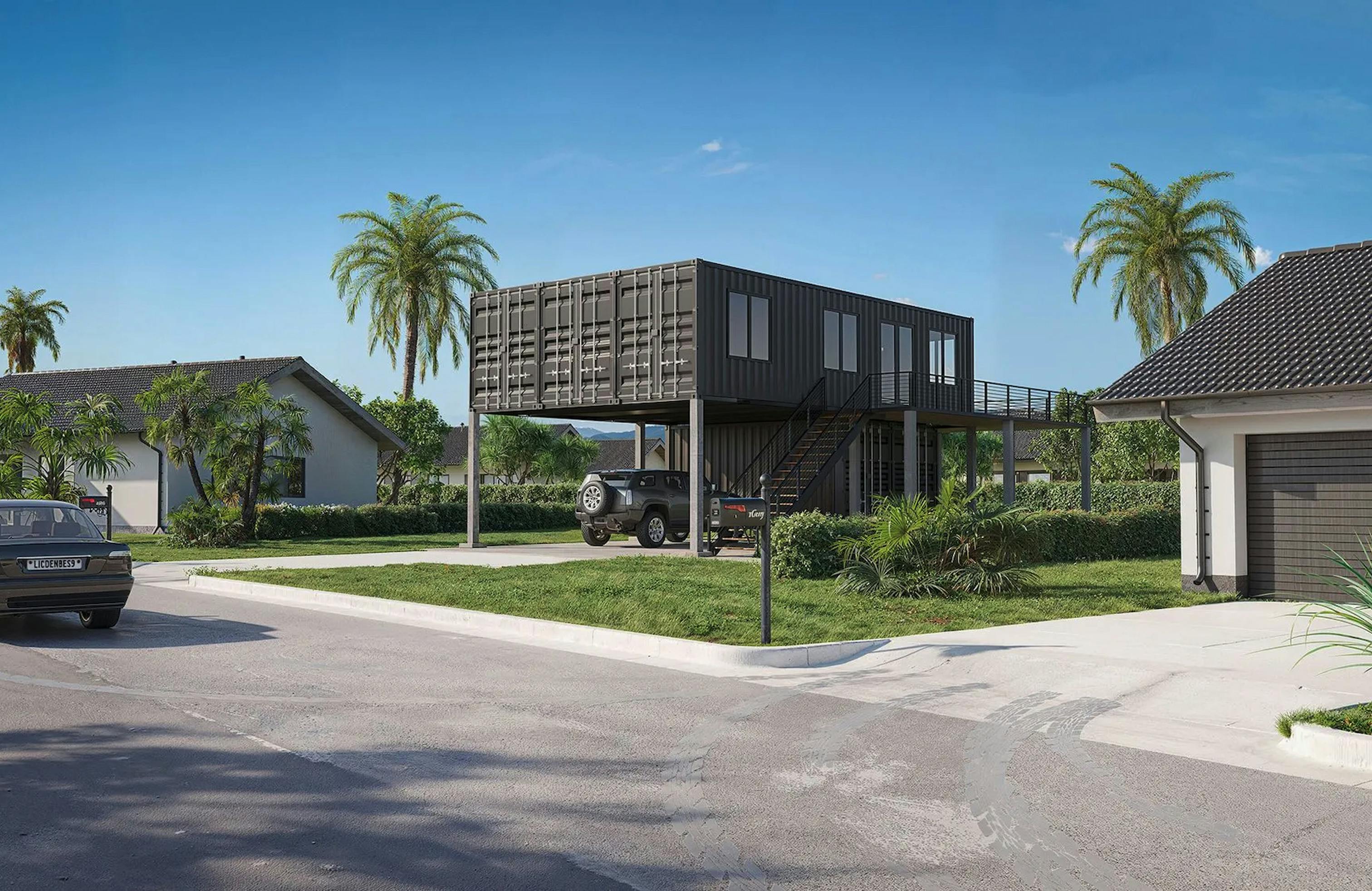
Lumara turns shipping containers into low‑impact homes. We rebuilt their site in Webflow, story‑led pages, trust‑building specs, and a single HubSpot form, to convert curious browsers into build‑ready leads.